
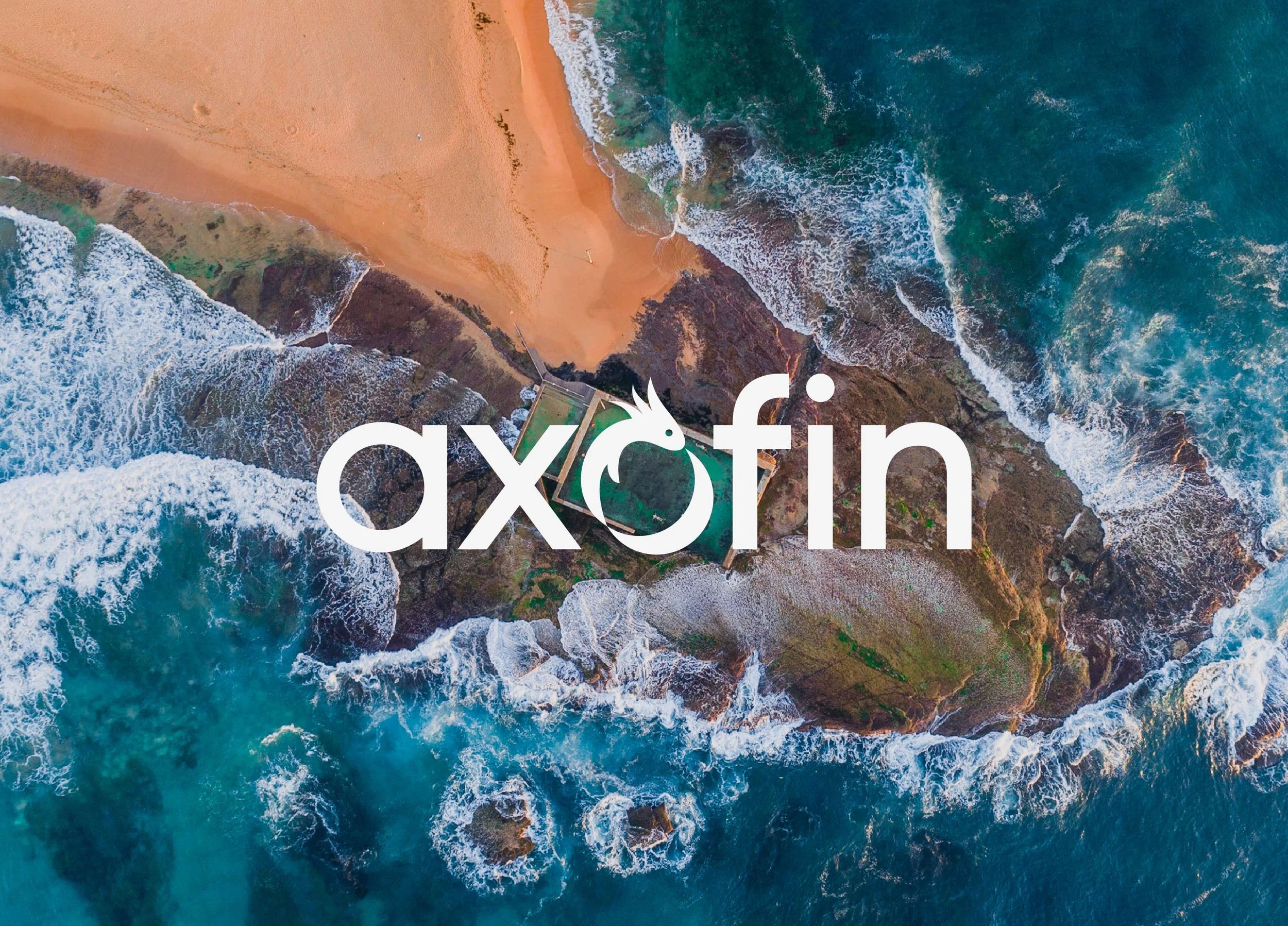
AXOFIN / BRAND IDENTITY
Adaptability at its heart.
A distinctive visual identity for Axofin, bringing together a clear wordmark, confident colour and expressive imagery.
SERVICES
CLIENT
Creative direction
Visual identity
Brand application
Axofin
THE OPPORTUNITY
Creating a brand with room to grow.
Axofin needed an identity that could help it stand apart in financial services and connect with its audience.
The opportunity was to create a visual language that felt clear and professional, while giving the brand a distinctive character of its own.

THE WORK
An identity built around adaptability.
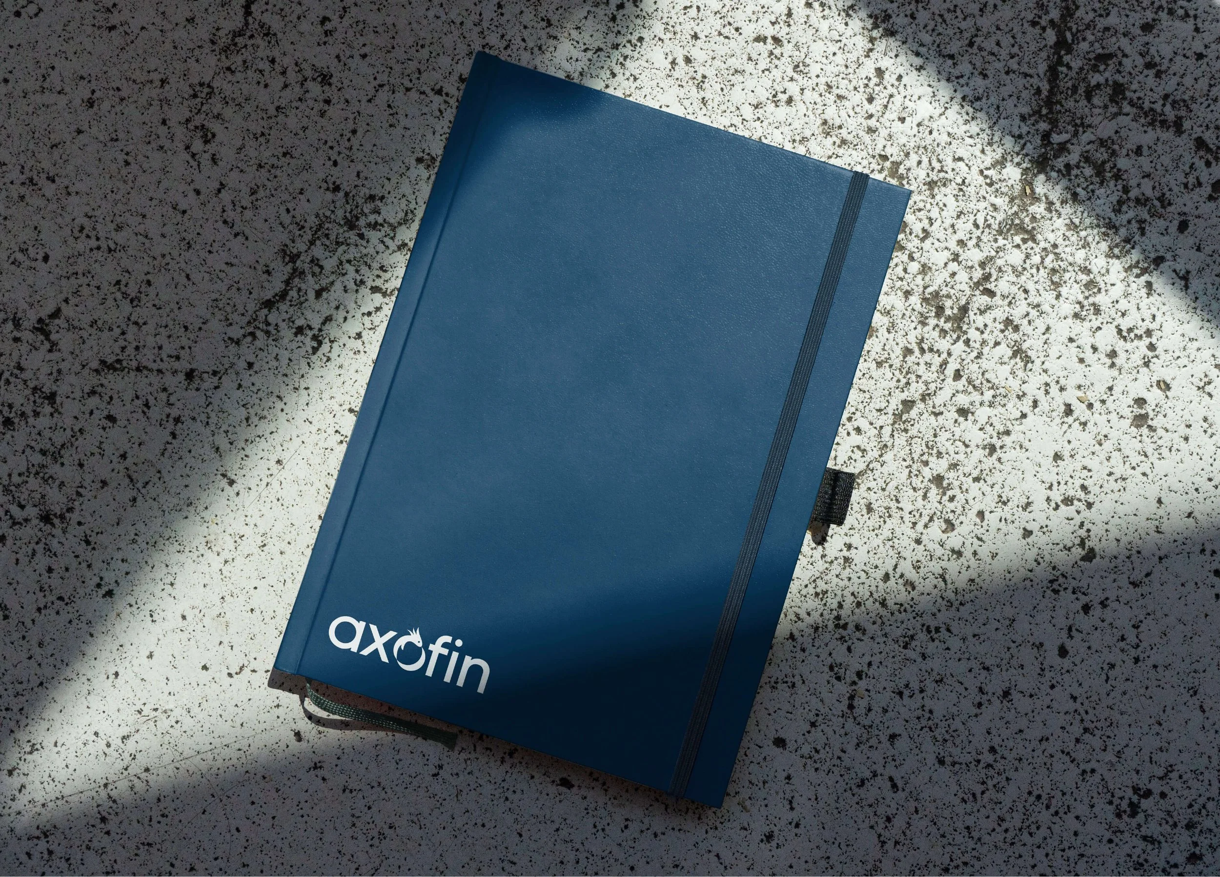
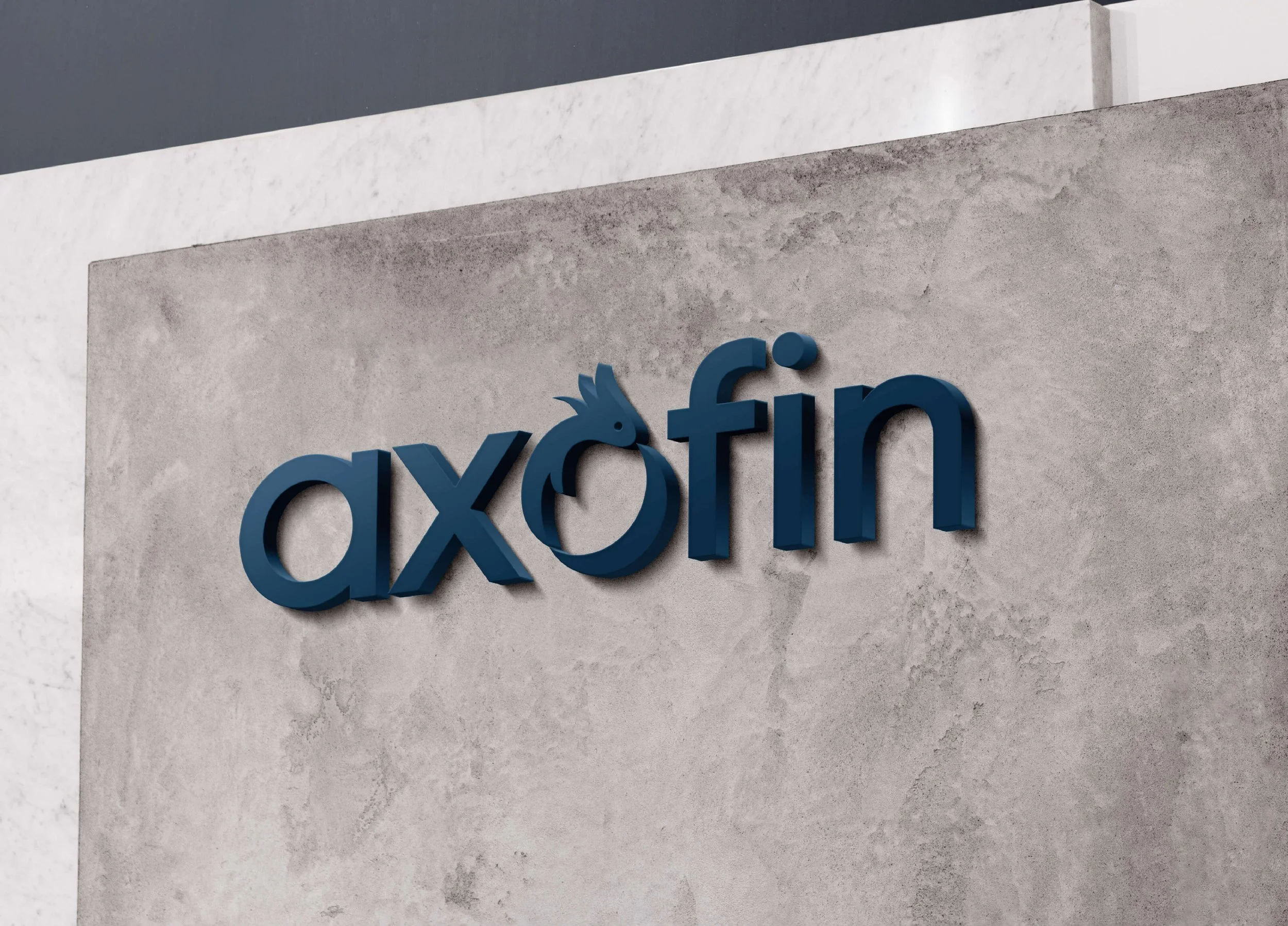
At the heart of the Axofin identity is “Axel”, an axolotl whose qualities of adaptability and resilience inspired the logo.
Integrated into the wordmark, Axel forms a circular symbol representing regeneration and renewal. Clean, geometric lettering gives the identity an approachable character, while deep blue provides a foundation of stability and professionalism.
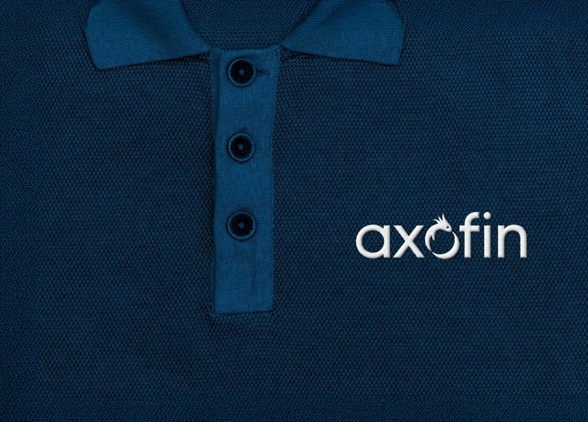
The symbol also works independently of the name, giving Axofin a recognisable asset for smaller applications, from an app icon to embroidered clothing.
01 / CREATIVE DIRECTION
A clear visual approach for the Axofin brand.
02 / VISUAL IDENTITY
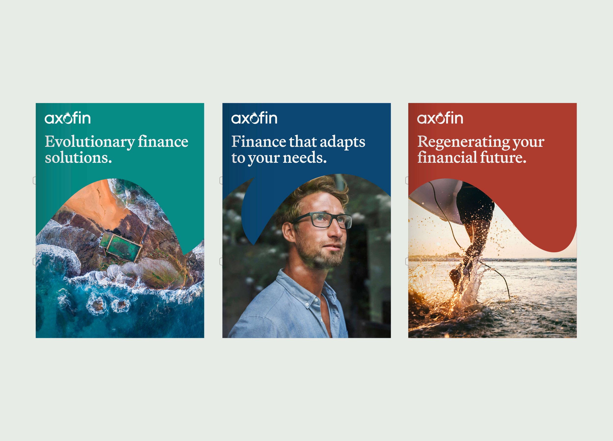
A distinctive wordmark, colour palette and imagery.
03 / BRAND APPLICATION
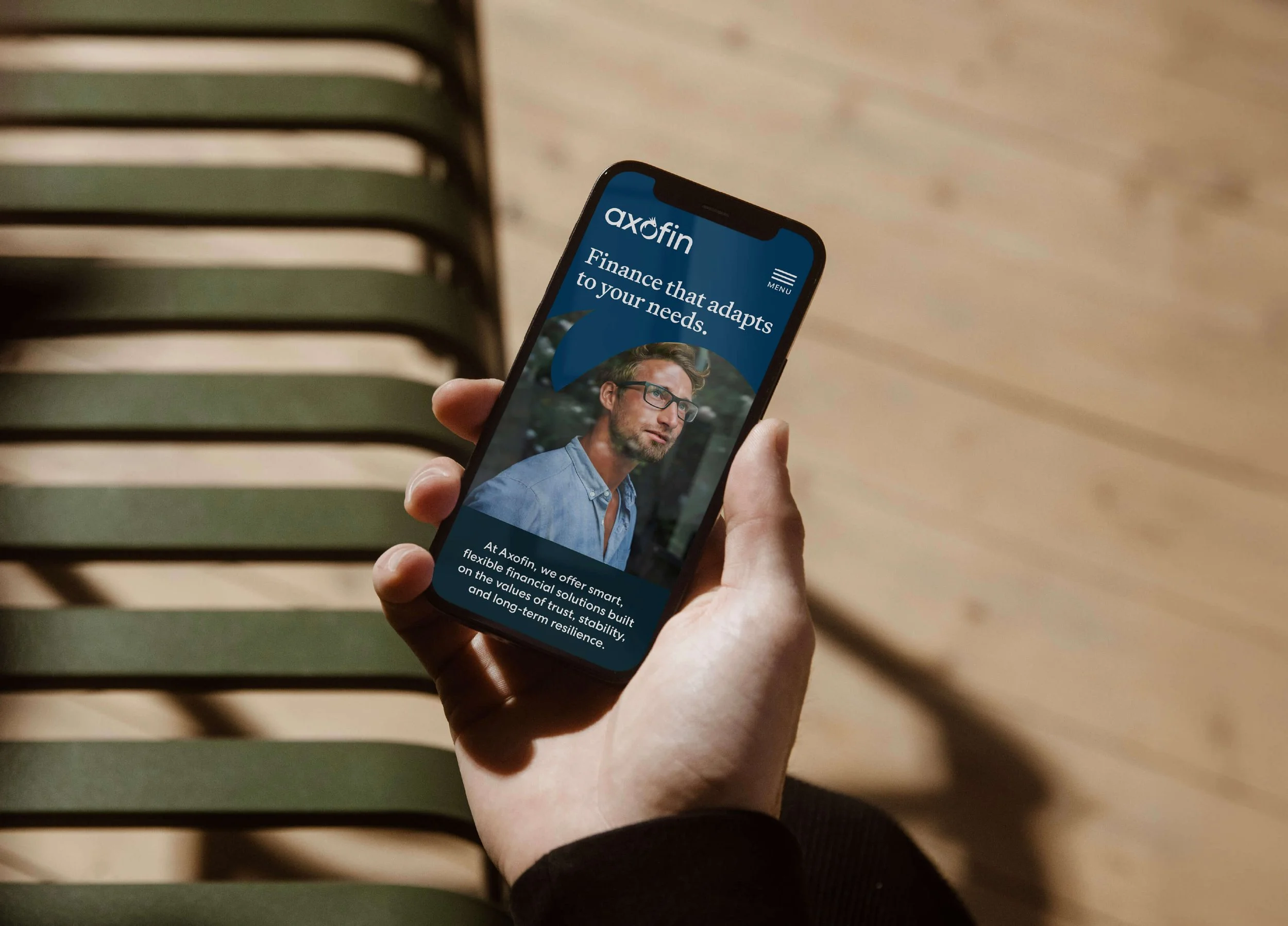
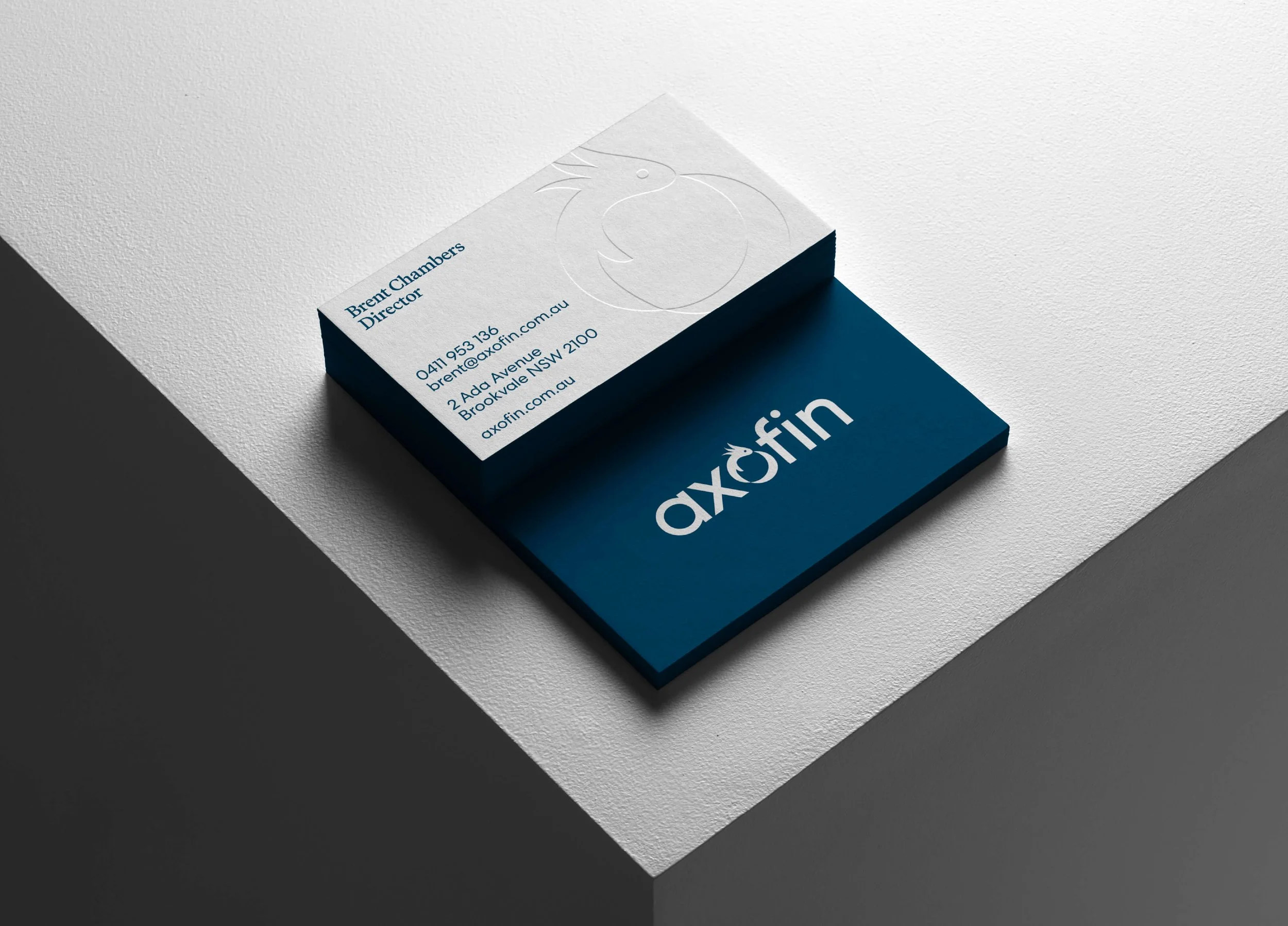
A flexible identity applied across digital and physical materials.
A brand ready to be recognised.
THE OUTCOME
A cohesive visual identity that gives Axofin a distinctive presence and a consistent way to show up across its communications.